
Critique: The Crusader
 Today’s quick critique is of The Crusader, Cardinal Gibbons High School’s student newspaper. As usual, the publication and issue were selected at random. Because this issue was only eight pages, the entire paper was reviewed, and portions of it are discussed here.
Page 1 is designed on a 3-column grid with somewhat tedious bastard text. There is one dominant photo to accompany the main story and a rule to separate stories.
Good: color
I like the splash of green that first appears in the flag. It also appears in the footer. The dominant photo even has three green cups in focus. The green is continued in the ampersands of the section heads.
Color can be a subtle, yet effective way to keep a publication consistent. The Crusader’s use of color is successful.
Not-so-good: brackets
Typically the first thing I see on a page is the dominant visual element, followed by the dominant headline. Aside from the flag, the first thing I noticed on Page 1 was the use of brackets.
 The occasional use of brackets is acceptable, even preferred if it helps to clarify the meaning, but when they are used too often, it gets to be an eyesore. Brackets break up the flow of the text and cause an awful eyesore for those of us who notice– and most of us notice when [these] start [popping] up [everywhere.]
In addition to making me nauseous trying to read the severed lines of text, brackets make me question the integrity of the quote. If this many brackets need to be used in a quote, it might be a good idea to reconsider publishing those words. Try paraphrasing. It looks better on paper and it doesn’t make me think the editors are putting their own words into a source’s mouth.
Good: cutlines and credits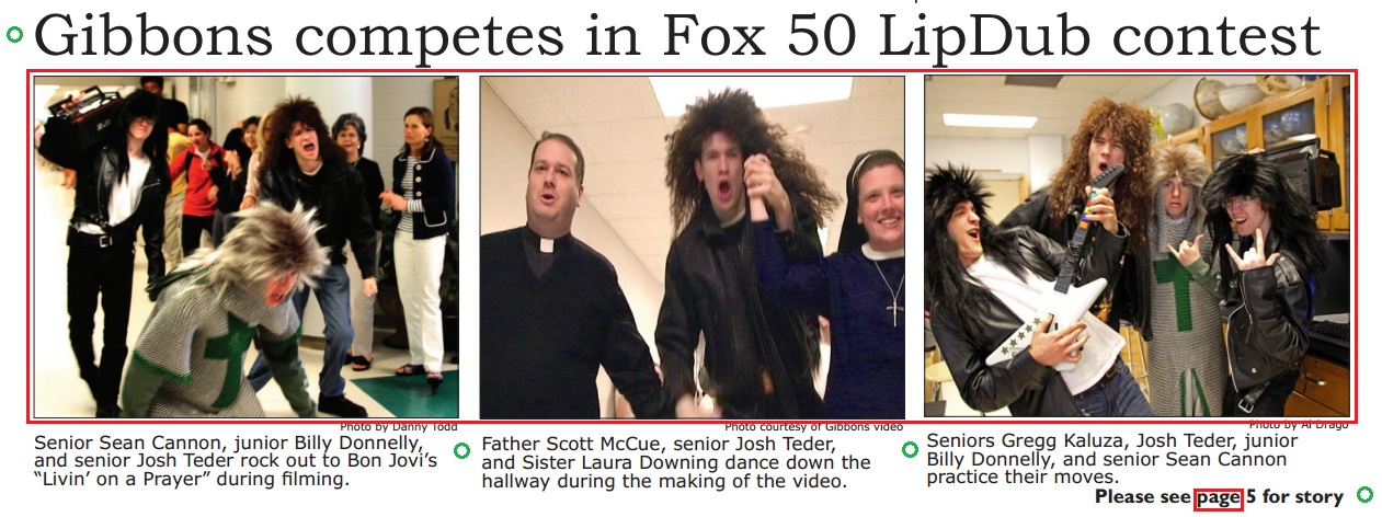
The photos at the bottom of Page 1 are competing images. However, their cutlines and photo credits are consistent with the paper’s style. The photo group is also a “reefer,” a delightful element used to tease the readers to turn to the inside of the paper.
(Bylines and titles are also consistent.)
Not-so-good: headlines
Though the headlines all seem to be down style, my personal preference for newspaper headlines, there is no sense of importance. The first story should have the largest headline, and as you read they should get smaller as the stories get less important. That is not the case in The Crusader.
 Good: justified copy
Not-so-good: inconsistent hyphenation
Hyphens, like brackets, are little beauty marks that sometimes go unnoticed. But when one story clearly has hyphens and its immediate neighbor does not, my stomach flops around a little.
Good: masthead
The masthead continues the color scheme…
Not-so-good: editorial policy
…but the editorial policy runs into the frame of the box.
Strongest page: Page 5 (Arts & Entertainment)
The dominant photo, a horizontal image featuring movement, is very dynamic. The 4-column grid is much easier to read than the grid on Page 1. While there still seems to be a big chunk of gray on the page, the images help distract from that. I would have liked to see the Q&A portion 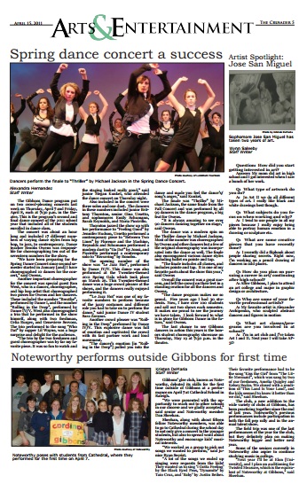 outlined in some way. This would help the add another visual element and allow the piece to stand out separately from the main story.
Overall, this paper’s layout is quite commendable. It’s definitely better composed than my high school paper was. Though I marked up a number of items that could be improved, I can say without a doubt that the editors of this publication are well on their way to journalistic careers.
*All images are modified screenshots from cghsnc.org.

Nice, newspaper critique! Very fitting.